官网:
https://meterial.io/components
优秀的Meterial design站点:
http://materialdesignblog.com/
并不是万能的,都有约束条件。
优点:兼容性好,可扩展性强,可测试性好,对主题的支持好。
缺点:组件不是特别丰富。
安装:
//其它方式
$ sudo cnpm i --save @angular/material@2.0.0-beta.7
$ sudo yarn add @angular/material --save
$ npm i @angular/material --save
安装的版本是"@angular/material": "^7.1.0",
有个依赖要手动安装
$ sudo yarn add @angular/cdk@6.4.6 --save
一、相关报错
1、控制台报警告:Could not find Angular Material core theme。
在styles.scss中引入angular materail主题:
内建主题有这几种:
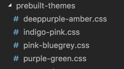
可以用scss自定义主题。
2、ERROR Error: Found the synthetic listener @transform.start. Please include either "BrowserAnimationsModule" or "NoopAnimationsModule" in your application.
二、Material组件
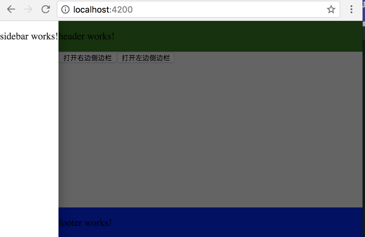
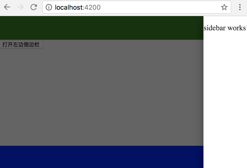
1、SidebarComponent侧边栏导航:
https://material.angular.io/components/sidenav/overview
 View Code
根容器<mat-sidenav-container>
over模式【默认】
side模式

push模式

position="end"
<mat-sidenav #sidenav mode="push" position="end">
侧边栏跑右边了,默认start。最多可以有2个侧边栏。
View Code
toogle方法:类似open
View Code
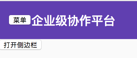
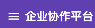
2、Toolbar完成头部和尾部
https://material.angular.io/components/toolbar/overview
用于头部,标题栏
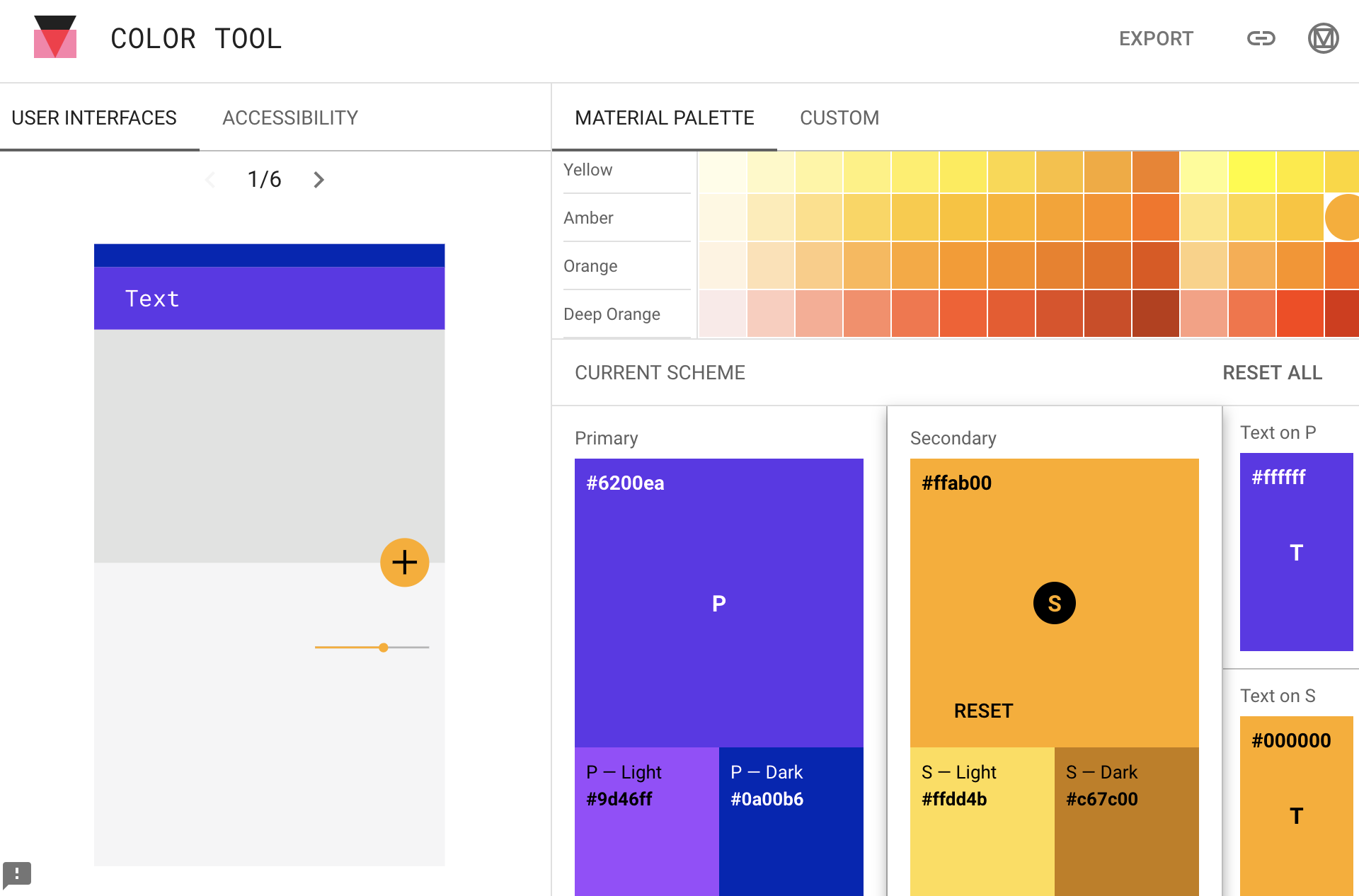
颜色primary紫色,accent黄色,warn红色。
主色:primary
配色:accent
用官方的material io 的COLOR TOOL可以调出合适的颜色。主色深紫,辅助色黄色效果如下。
1、居中用flex怎么实现?
在想居中元素两边都放了自动扩大充满的元素。
在styles.scss中加入
.fill-remaining-space {
  // 使用 flexbox 填充剩余空间
  // @angular/material 中的很多控件使用了 flex 布局
  flex: 1 1 auto;
}
<mat-toolbar color="primary"> <span class="fill-remaining-space"></span> <span>© strof 版权声明</span> <span class="fill-remaining-space"></span> </mat-toolbar>
2、两行内容怎么实现?


<mat-toolbar color="primary"> <mat-toolbar-row> <span class="fill-remaining-space"></span> <span>© starof 版权声明</span> <span class="fill-remaining-space"></span> </mat-toolbar-row> <mat-toolbar-row> <span class="fill-remaining-space"></span> <span>这是第二行</span> <span class="fill-remaining-space"></span> </mat-toolbar-row> </mat-toolbar>
3、菜单button调出左边sidebar
4、 用一个icon代替菜单2个文字
https://material.angular.io/components/icon/overview
使用图标字体,基于字体的,好处占用资源小,矢量图,内建material icon支持。
<link href="https://fonts.googleapis.com/icon?family=Material+Icons" rel="stylesheet">
<button mat-icon-button (click)="openSidebar()">
        <mat-icon class="material-icons">menu</mat-icon>
</button>
想要使用其它图标直接,去https://material.io/tools/icons/ 找到图标对应文字替换掉即可。
5、MatIcon也支持SVG图标。
找SVG资源,http://iconfont.cn/ 阿里爸爸矢量图标库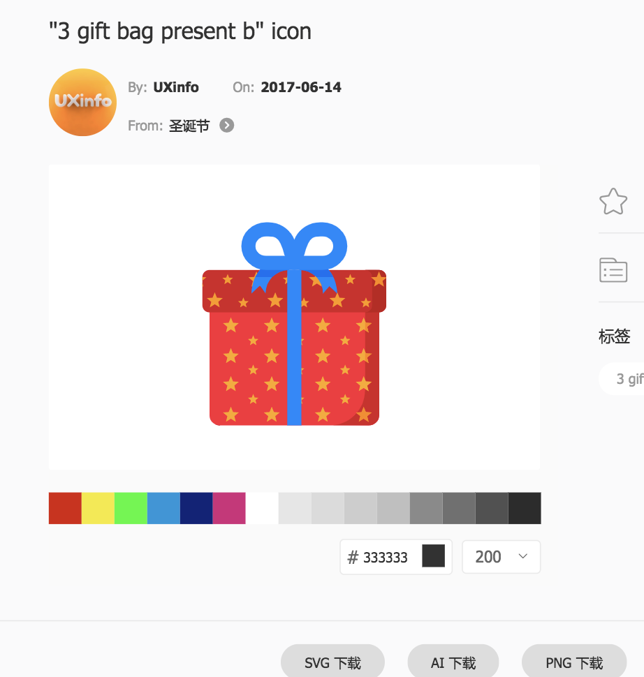
把下载好的SVG放在项目的assets中。
最终效果:
  constructor(private iconRegistry: MatIconRegistry,
    private sanitizer: DomSanitizer) {
    iconRegistry.addSvgIcon('gift', sanitizer.bypassSecurityTrustResourceUrl('assets/gift.svg'));
  }
<mat-icon svgIcon="gift"></mat-icon>
问题,每次使用一个新图标都要注册一遍。图标分散在各个组件的constructor中,难以维护。
更好的做法:
在app下创建一个utils目录,在utils里建一个svg.util.ts。
import { MatIconRegistry } from "@angular/material";
import { DomSanitizer } from "@angular/platform-browser";

export const loadSvgResources = (ir: MatIconRegistry, ds: DomSanitizer) => {
  ir.addSvgIcon("gift", ds.bypassSecurityTrustResourceUrl("assets/gift.svg"));
};
不在组件的constructor里导入里,在core module里只加载一次。
export class CoreModule {
  constructor(
    @Optional() @SkipSelf() parent: CoreModule, //加上@SkipSelf()注解
    ir: MatIconRegistry,
    ds: DomSanitizer
  ) {
    if (parent) {
      throw new Error("模块已经存在,不能再次加载");
    }
    loadSvgResources(ir, ds);
  }
}
这样其它页面只要用就可以,解决了装载资源分散的问题。
3、Input组件matInputModule
可以通过color取值warn,accent等来改变input输入框的颜色。
可以通过floatLabel取值float,always,auto来改变Label显示方式。
可以设置hintLabel或者<mat-hint>来添加更多提示信息。
可以通过给<mat-form-field>里的元素设置matSuffix指令来给输入框添加后缀,设置matPrefix指令加前缀。
https://material.angular.io/components/form-field/overview
<mat-form-field class="example-full-width" color="warn" floatLabel="auto" hintLabel="Max 10 characters">
            <input #input matInput placeholder="您的email">
            <span matSuffix>@gmail.com</span>
            <mat-hint align="end">{{input.value?.length || 0}}/10</mat-hint>
</mat-form-field>

4、Card组件和Button组件
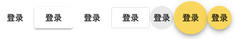
mat-button
| Rectangular text button w/ no elevation |
mat-raised-button
| Rectangular contained button w/ elevation |
mat-flat-button
| Rectangular contained button w/ no elevation |
mat-stroked-button
| Rectangular outlined button w/ no elevation |
mat-icon-button
| Circular button with a transparent background, meant to contain an icon |
mat-fab
| Circular button w/ elevation, defaults to theme's accent color |
mat-mini-fab
|
View Code

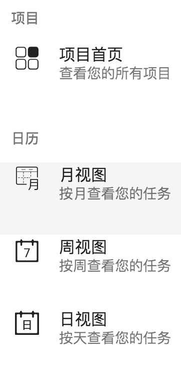
5、List
https://material.angular.io/components/list/overview
包括都行列表,带图标列表,带头像列表,密集列表(dense list)和多段列表。
分为<mat-list> 和<mat-nav-list>
在侧滑菜单中使用List。
matNavList鼠标hover上去会有高亮效果。
View Code
Dense list会让列表的字体shrink来显示更多内容。用法<mat-nav-list dense>。
把日式图的图标改变成当天的日前,在svg.util.ts中加入提前准备好的30天日期day1.svg到day3-.svg.
View Code
在sidebar.component.ts中引入一个类库day-fns。
npm uninstall --save date-fns //先安装date-fns
npm install --save-dev @types/date-fns //再date-fns针对typescript也可以使用的类型
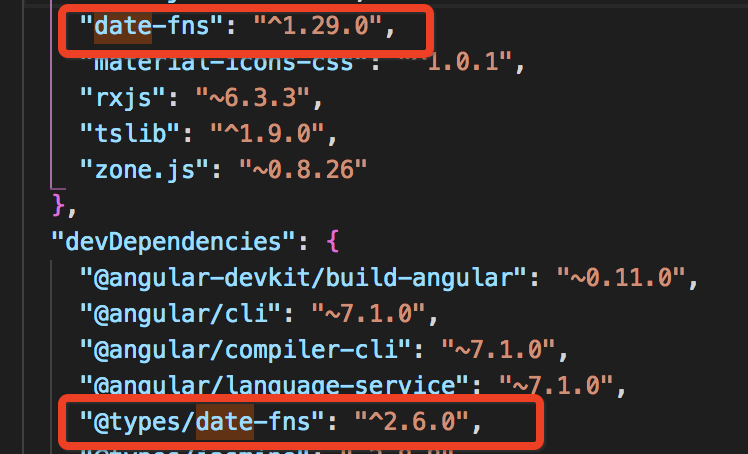
import { Component, OnInit } from '@angular/core';
import {getDate} from 'date-fns'; //getDate取得是一个月的几号

@Component({
  selector: 'app-sidebar',
  templateUrl: './sidebar.component.html',
  styleUrls: ['./sidebar.component.scss']
})
export class SidebarComponent implements OnInit {
  today = 'day';
  constructor() { }

  ngOnInit() {
    this.today=`day${getDate(new Date())}`; //today对应icon的名字
  }

}
模版中icon对应到today。

6、GridList
View Code
注册页面头像列表可以用GridList实现。
7、dialog
https://material.angular.io/components/dialog/overview
对话框很特殊,和menu一样需要在模块中的entryComponents中声明。
由于它们是需要事先完全隐藏,或者隐藏一部分。一开始模块加载的时候是看不到dialog的,点击按钮才能弹出。对于这种情况,需要一个预加载,就需要放在模块的entryComponents中。
1、从调用者向Dialog传递数据
传递数据:
不能像其它组件一样,通过路由去传递数据。需要从它的调用者去写。
在按钮的click事件中写:
const dialogRef = dialog.open(YourDialog, {data:'Your data'});
接收数据:
在Dialog的构造中注入MD_DIALOG_DATA就可以取得数据。
constructor(@Inject(MAT_DIALOG_DATA) private data: any) { }
2、在Dialog把数据往回传,传给调用者。
//注入MatDialogRef
 constructor(@Inject(MAT_DIALOG_DATA) private data: any,
    public dialogRef: MatDialogRef<NewProjectComponent>, ) { }
//在点击保存按钮时候发送数据
  onSave() {
    this.dialogRef.close('I received your message');
  }


//调用者open的时候拿到一个引用,注册afterClosed事件返回一个Observable
  openNewProjectDialog() {
    // this.dialog.open(NewProjectComponent,{data:'this is a dialog'});
    const dialogRef = this.dialog.open(NewProjectComponent, {
      data: "this is a dialog"
    });
    dialogRef.afterClosed().subscribe((result)=>{
      console.log(result);
    });
  }
3、Dialog样式支持主题
//注入OverlayContainer
constructor(@Inject(MAT_DIALOG_DATA) private data: any,
    public dialogRef: MatDialogRef<NewProjectComponent>,
    private oc: OverlayContainer) { }

//通过传入dark来切换class
  ngOnInit() {
    console.log(JSON.stringify(this.data));
    this.oc.themeClass = this.data.dark ? 'myapp-dark-theme' : 'null';
  }
报错:ERROR in src/app/project/new-project/new-project.component.ts(18,13): error TS2339: Property 'themeClass' does not exist on type 'OverlayContainer'.
参考:
https://gist.github.com/tomastrajan/ee29cd8e180b14ce9bc120e2f7435db7
8、autoComplete
https://material.angular.io/components/autocomplete/overview
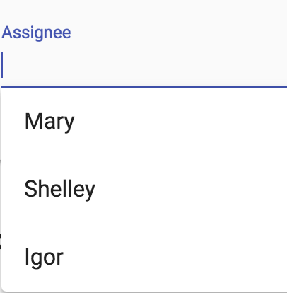
<form class="example-form">
  <mat-form-field class="example-full-width">
    <input type="text" placeholder="Assignee" aria-label="Assignee" matInput [formControl]="myControl" [matAutocomplete]="auto">
    <mat-autocomplete #auto="matAutocomplete" [displayWith]="displayFn">
      <mat-option *ngFor="let option of filteredOptions | async" [value]="option">
        {{option.name}}
      </mat-option>
    </mat-autocomplete>
  </mat-form-field>
</form>
displayWith传入一个函数,指明具体怎样显示
  displayFn(user?: User): string | undefined {
    return user ? user.name : undefined;
  }
9、menu
<button mat-button [matMenuTriggerFor]="menu">Menu</button>
<mat-menu #menu="matMenu">
  <button mat-menu-item>Item 1</button>
  <button mat-menu-item>Item 2</button>
</mat-menu>
10、复选框,单选组件和下拉框
<mat-checkbox>和<mat-radio>和<mat-select>
checkbox还要chenged事件处理
<mat-checkbox [checked]="item.completed" class="status"> </mat-checkbox>
  <div class="content" mat-line [ngClass]="{'completed':item.completed}">
    <span [matTooltip]="item.desc">{{item.desc}}</span>
  </div>
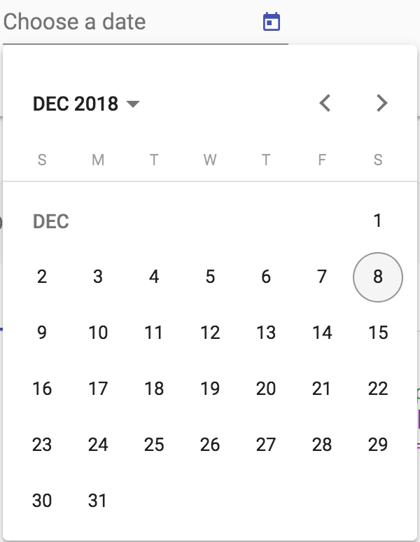
11、DatePicker
https://material.angular.io/components/datepicker/overview
<mat-form-field>
  <input matInput [matDatepicker]="picker" placeholder="Choose a date">
  <mat-datepicker-toggle matSuffix [for]="picker"></mat-datepicker-toggle>
  <mat-datepicker #picker></mat-datepicker>
</mat-form-field>